


The Drive workspace
Every screen in Drive uses the same frame. Once you know the sidebar and the top bar, you know your way around the whole product.
The sidebar
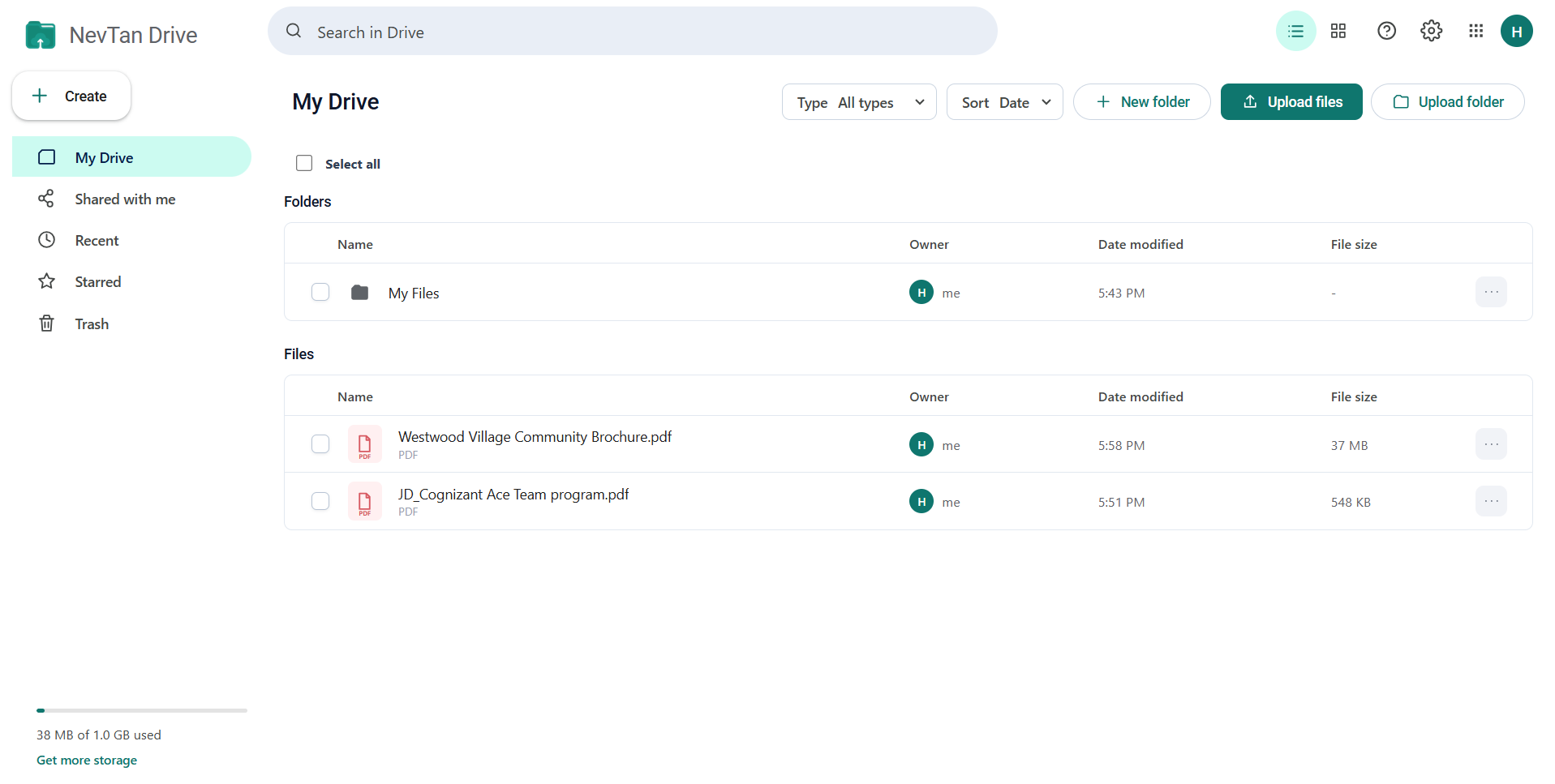
The left column carries the NevTan Drive logo, the Create button, the five destinations, and your storage meter.
The Create button
Select Create to open a short menu with two actions, available from every page:
- Create folder — opens a dialog to name a new folder in the current location.
- Upload file — opens your computer's file picker.
Destinations
| Item | Shows |
|---|---|
| My Drive | Your folders and files, plus files shared with you, starting at the root. |
| Shared with me | Only the files other people have shared with you. |
| Recent | Files ordered by when they were last opened or changed. |
| Starred | Files you have starred. |
| Trash | Deleted items awaiting restore or permanent deletion. |
The storage meter
At the bottom of the sidebar, a bar shows how much of your quota you have used. This is your combined NevTan total — Drive files plus your NevTan Mail mailbox. See Storage and quota for the breakdown.
The top bar
The top bar holds search on the left and five controls on the right.
| Control | What it does |
|---|---|
| Search in Drive | Searches your files as you type. An ✕ appears inside the box to clear it. |
| List / grid toggle | Switches between the row list and the tile grid. Your choice is remembered in that browser. |
| Help (?) | Opens a panel of short answers to the most common questions, with a link to NevTan support. |
| Settings (gear) | Switch view mode, open Storage details, or refresh Drive. |
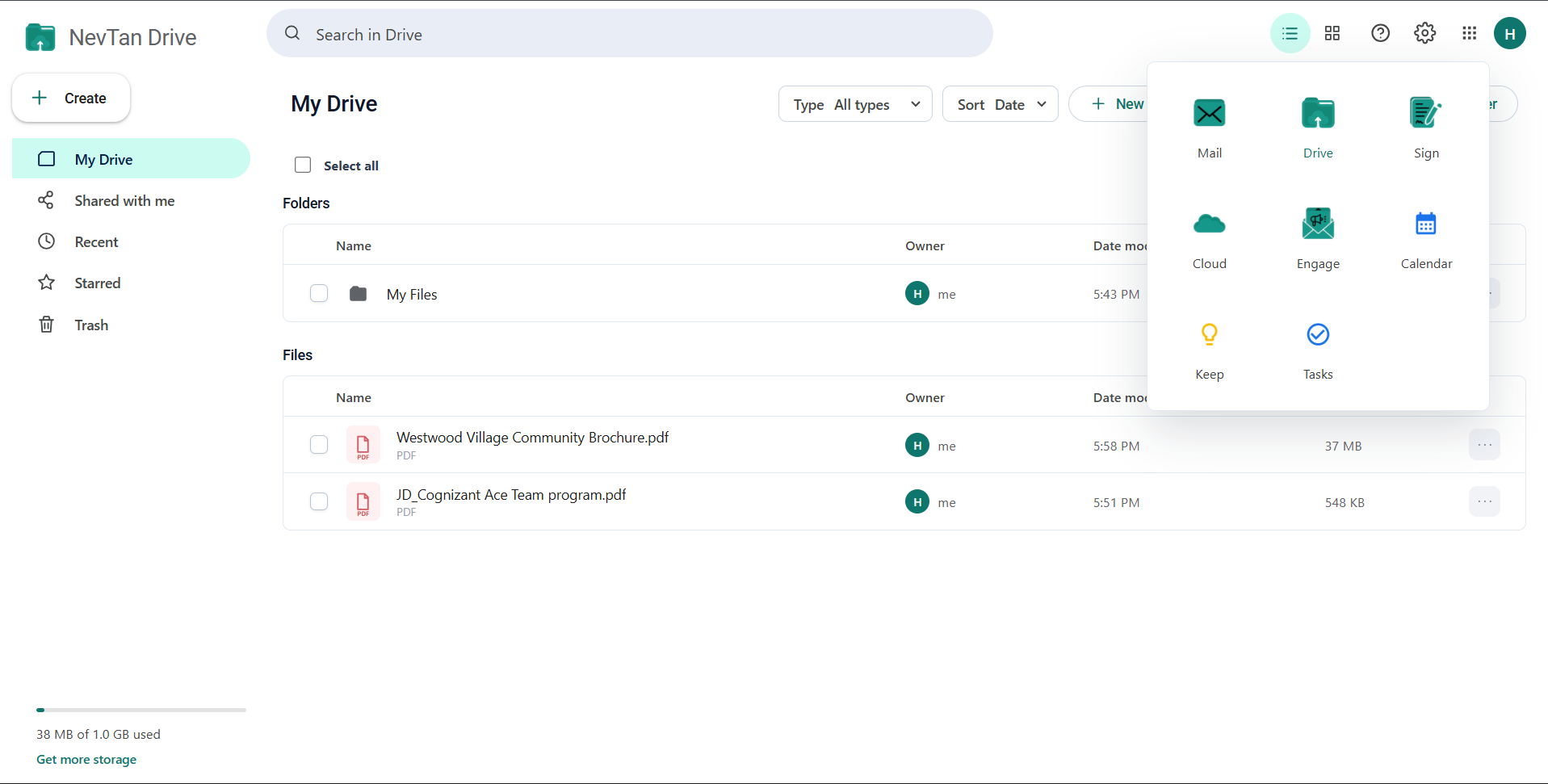
| Apps (grid) | Opens the NevTan app switcher — Mail, Drive, Sign, Cloud, Engage, Calendar, Keep, and Tasks. |
| Avatar | Shows the signed-in account and the sign-out link. |
The content area
The middle of the screen shows the current location's title, breadcrumbs when you are inside a folder, the Type and Sort controls, the New folder and Upload buttons, and then the folders and files themselves.
A thin toolbar sits above the list with a Select all checkbox on the left and, when the list is longer than 15 items, page controls on the right. Selecting items turns that toolbar into a row of bulk actions — see Uploading and managing files.
List view and grid view
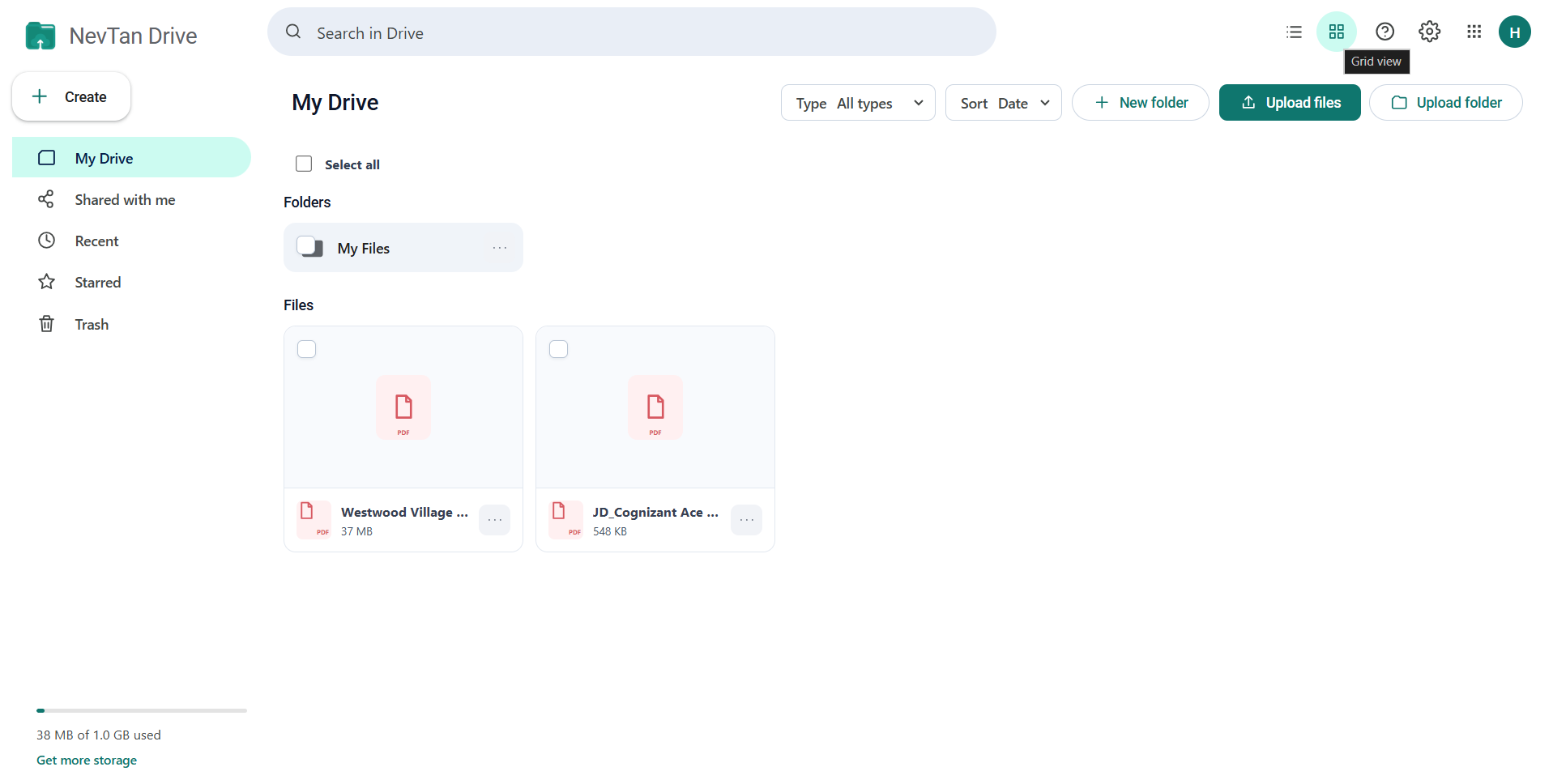
List view shows one row per item with name, owner, last modified date, and size — best for scanning a lot of files. Grid view shows larger tiles — better for images and folders. Switch with the toggle in the top bar or from the settings menu; the choice sticks for that browser.
Toasts and messages
Actions confirm themselves with a small message in the corner — “Folder created”, “Item moved to Trash”, “Link copied”. Errors appear the same way in red. If a whole page fails to load, you get a panel with the reason and a Try again button rather than an empty screen.
Common questions
How do I switch between list view and grid view?
Use the list / grid toggle in the top bar, or the settings (gear) menu. List view gives one row per item with name, owner, modified date and size; grid view gives larger tiles, which suits folders of images. Your choice is remembered in that browser.
What does the storage meter in the sidebar count?
It is your combined NevTan total, not Drive alone — your Drive files plus your NevTan Mail mailbox, shown as one figure. Storage and quota breaks the number down and explains how to free space.
What is the grid icon in the top bar?
It opens the NevTan app switcher, which moves you between Mail, Drive, Sign, Cloud, Engage, Calendar, Keep, and Tasks without signing in again. Drive is marked as the app you are currently in, and the others open in a new tab.